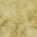
background old paper paper paper background parchment rough vintage
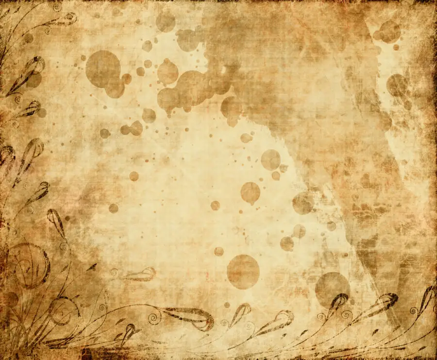
Free image of a vintage brown old paper with grunge background
Hi, Here is one I created last night. To give the story and credit where it is due…
Horemweb pointed me to an image he created using one of textures and posted on deviant art (which is here but is adults only)
So while I was there I had a wander around and thought it has been years since I’ve been here, couldn’t remember my username and no longer have access to the email account I would have been using at the time so created a new account. Anyway amongst the many interesting things on there I came across this very cool grunge paper texture by arghus.
I then fired up photoshop and created the above image which went fine and I thought while doing it I would add a detailed how to and maybe post the psd file. By the end I decided I wasn’t going to keep it and closed it all. Got up this mornign and saw that I had created a jpg and decided I will upload after all, but I no longer have the psd so have to go from memory. I know I am going to be missing some steps mostly colour fixes and I can’t remember the mode settings (I use soft light and multiply a lot, anyway not hard to play with)
I started with the old worn yellow paper as the backing.
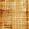
I then grabbed this parchment image and added it while also creating a layer mask for it from a grunge concrete layer (I ramped up the contrast on that one and then selected the blue channel and just used that with a little bit of brush work using a soft low opacity brush on the bottom left to lessen the strength of the mask).
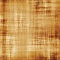
I then brought in arghus’s image, rotated, resized etc and added to my stack, I brushed some areas I didn’t want.
Adjusted curves and saturation and then added copied arghus’s image again and run a gaussian blur (roughly 100 pixels) over it and change the mode to colour.
Added another copy the parchment and re-added as soft light on low opacity to strengthen a touch.
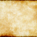
Finally I went and got this old worn paper and added it on top (probably with soft light), mostly to bring in the extreme edges and lighten the middle.
So there it is, five images combined with a very rough description of how it was done, hope you like it.
 Free Textures, Photos & Background Images Free high resolution textures, backgrounds and patterns by categories, colors and tags. Free for commercial and personal use.
